1

Where is the S&P500 Going? Another Unscientific Look

Betting, Outright Gambling on the Stock Market

On 19 Feb 2009 I wrote an article arbitrarily calling for the S&P 500 to bottom at 650. Where is the S&P500 Going? An Unscientific Look.  It bottomed out on 9 Mar 2009 at 676.

 Prescience? No. Intelligence? No. Skill? No. Absolutely none of the above. Luck? Yes. Luck. Nobody consistently calls the market. Nobody. Period. But we can play a very entertaining game of Guess Where the Stock Market is Going. It costs very little, unless you put money behind it, in which case it either makes a lot or it costs a lot. I had the luxury of buying selective Asian small caps in late February based on my own shot in the dark GUESS of where the market was going and that’s nice but not something I would count on as a long term means of feeding my family.

So, here is the chart I was looking at in February, updated to 7 Sep 2009. 

The S&P 500 at 1016, 4 Sep 2009

spx200909act


The easy call is over. At 780 with market sentiment highly distressed it is very easy to call a further 100 points decline. I’ve done that and put money behind that call. Was I sure? Hell no. If I did I would have mortgaged the wife and kid to do the trade. Instead I took small, controlled, well researched positions to make up for my fear and uncertainty at the time. That’s what you do when you are not sure. And that is to add to the painful investments I made too early in 2008. Now what? The market has rebounded over 50%. Who know’s where the market will go. But looking at the chart, a retracement to 750 is not improbable. Here is how it would look, visually without all the cool statistics and quant indicators that only PhD’s and finance types understand…


The S&P500 at 750


spx200909750

It doesn’t look ridiculous, it doesn’t look out of this world. And will not look out of this world if it trades within a range of 800 – 1000. It would look a bit volatile if it traded up to 1400, but it wouldn’t look ridiculous there either. Do I think it will get there? No. I think 800 is more likely. Why? Fundamentals have improved but not so much that they justify stock market prices at even current levels.

How about if we debase all currencies so that relative FX prices remain fairly constant but the prices of stuff, that is goods, services, resources that are found or grow in the ground, rise. What then? Well, stock prices are likely to be supported as well, and the same goes for bond prices. That’s what happens when the yardstick is shortened.

When will markets head south towards 800? Later in the year is my guess. The market is being sustained by skeptics and bears and until the marginal buyer is exhausted, the market can and is likely to keep rising.

Serial Correlations in Investment Returns

Autocorrelations:

The investment world loves correlations. Option hedgers love correlations. Everyone loves correlations. Across assets. But how about across time, within the same asset? 

To what extent do the returns today depend on the returns yesterday, the month before, 3 months before or a year ago? Positive correlations with past returns are a sign of momentum, negative correlations, of mean reversion. Assets can exhibit both, all at once. Smoothing of returns also shows up as serial correlation or a moving average. Liquid markets with efficient price discovery tends to exhibit little serial correlation. Here is a quick – non rigorous – illustrative view of serial correlations in different markets.


Equities:

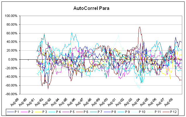
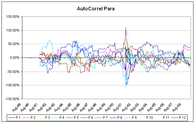
MSCI World autocorrelations. The strongest autocorrelations of the MSCI world are in the 1 month lags. That said, this autocorrelation is not statistically significant. You can see how unstable the autocorrelations look over time. Equities are liquid and price discovery is efficient and as expected, data appears not to be autocorrelated.


MSCI World Autocorrelations (Simple)*

mxwdARP


Hedge Funds:

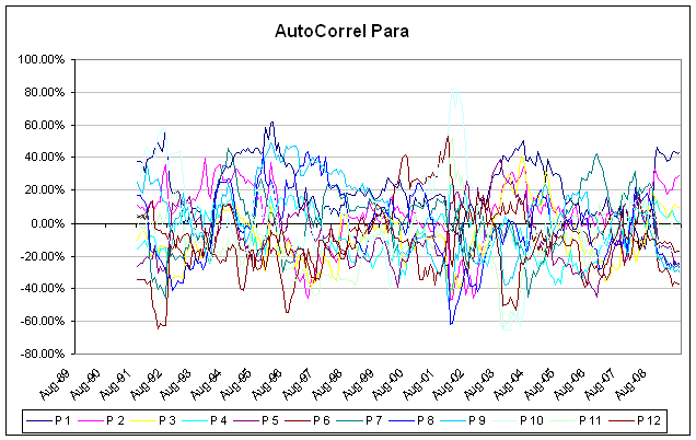
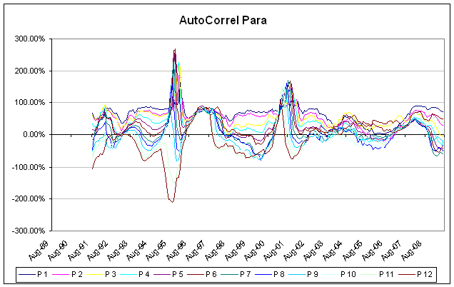
Hedge fund autocorrelations are weak and display little structure over time as well. There have been studies into hedge fund autocorrelations which find evidence of smoothing. Over a 2 year period, tests for autocorrelations are not significant and graphically one can see how unstable the autocorrelations look over time. This is certainly true of the HFRI Hedge Fund Index. A similar pattern is seen in the HFRI Fund of Funds Index. Of course there are strategies which exhibit autocorrelation. These tend to be strategies in illiquid markets or securities where the pricing of the underlying assets are less efficient. Assets that have their valuations smoothed, are valued on appraisal value as opposed to transacted values, are based on comparable transactions with a lag, which are marked to model, tend to exhibit serial correlation. The HFRI Indices exhibit little serial correlation primarily because of the preponderance of liquid equity and macro strategies. Strategies involved in assets such as the illiquid range of credit, PIPEs, private equity, tend to exhiit serial correlation.


HFRI Hedge Fund Index Autocorrelations (Simple)*

HFRIARP


HFRI Fund of Hedge Fund Index Autocorrelations (Simple)*

HFRIFOFARP


Real Estate:

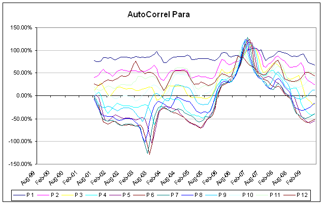
Real estate returns display high autocorrelation and the 1 month autocorrelation is statistically significant. Variances (and hence volatility) are therefore understated, sometimes severely, as are correlations to other assets. The Case Shiller data goes back about 10 years but the UK IPD index goes back over 20. In both cases one can see the stability of the 1, 2 an 12 month autocorrelations.


S&P Case Shiller Autocorrelations (Simple)*

CaseShillerARP


IPD UK Property Autocorrelations (Simple)*

IPDARP


Issues with Serial Correlation:

Where returns are serially correlated:

  • Volatility is not consistently estimated and is often underestimated
  • An estimator for the true volatility can be estimated but there is error of estimation involved.
  • Correlations are not consistently estimated and are often underestimated
  • Portfolio level risk measurement is therefore not consistently estimated and is often underestimated

Opportunities in Serial Correlation:

Whatever the true underlying volatility of the real estate markets, the Case Shiller and UK IPD real estate indices will be smoothed. Currently it appears that they are on a recovery path and will likely be positive for the next 12 to 18 months. Real estate indicators will likely remain positive despite the true picture on the ground.

Serially correlated assets have underlying volatility that is under-estimated. Correlations with other assets, even liquid, non-serially correlated ones will be under-estimated as well. That means that a volatility of a portfolio of such assets will be under-priced.


*note that the autocorrelations shown here in the charts are simple pairwise autocorrelations and not the rigorous a multi lag model as the graphical representation of the results is hard. Tests for significance are done with the multi lag models.


Where is the S&P500 Going? Another Unscientific Look

Betting, Outright Gambling on the Stock Market

On 19 Feb 2009 I wrote an article arbitrarily calling for the S&P 500 to bottom at 650. Where is the S&P500 Going? An Unscientific Look.  It bottomed out on 9 Mar 2009 at 676. Prescience? No. Intelligence? No. Skill? No. Absolutely none of the above. Luck? Yes. Luck. Nobody consistently calls the market. Nobody. Period. But we can play a very entertaining game of Guess Where the Stock Market is Going. It costs very little, unless you put money behind it, in which case it either makes a lot or it costs a lot. I had the luxury of buying selective Asian small caps in late February based on my own shot in the dark GUESS of where the market was going and that’s nice but not something I would count on as a long term means of feeding my family.

So, here is the chart I was looking at in February, updated to 7 Sep 2009. 

The S&P 500 at 1016, 4 Sep 2009

spx200909act


The easy call is over. At 780 with market sentiment highly distressed it is very easy to call a further 100 points decline. I’ve done that and put money behind that call. Was I sure? Hell no. If I did I would have mortgaged the wife and kid to do the trade. Instead I took small, controlled, well researched positions to make up for my fear and uncertainty at the time. That’s what you do when you are not sure. And that is to add to the painful investments I made too early in 2008. Now what? The market has rebounded over 50%. Who know’s where the market will go. But looking at the chart, a retracement to 750 is not improbable. Here is how it would look, visually without all the cool statistics and quant indicators that only PhD’s and finance types understand…


The S&P500 at 750


spx200909750

It doesn’t look ridiculous, it doesn’t look out of this world. And will not look out of this world if it trades within a range of 800 – 1000. It would look a bit volatile if it traded up to 1400, but it wouldn’t look ridiculous there either. Do I think it will get there? No. I think 800 is more likely. Why? Fundamentals have improved but not so much that they justify stock market prices at even current levels.

How about if we debase all currencies so that relative FX prices remain fairly constant but the prices of stuff, that is goods, services, resources that are found or grow in the ground, rise. What then? Well, stock prices are likely to be supported as well, and the same goes for bond prices. That’s what happens when the yardstick is shortened.

When will markets head south towards 800? Later in the year is my guess. The market is being sustained by skeptics and bears and until the marginal buyer is exhausted, the market can and is likely to keep rising.


Quant Risk Management and Other Fallacies

Quant Risk Management

Statistical or mathematical techniques have been used in investment management and finance to better understand risk but there are limitations, sometimes severe limitations.

 At the end of the day, there is no substitute for common sense and an understanding of the sometimes complex underlying drivers of price relationships that often become oversimplified in a mathematical or statistical context. We can talk about Value at Risk and its various augmentations to handle non-Gaussian distributions, we can look at conditional Gaussian multi-variate distributions. Or we can take a look at a simple example. Lets look at the relationships between 3 auto stocks in Europe, Fiat, Renault and Peugeot.

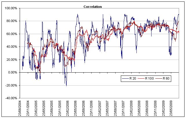
Fiat versus Renault

frnocorr 

  • 20 day correlation ranges from -20% to +90%.
  • 60 day correlation ranges from -2% to +70%.
  • 100 day correlation ranges from +6% to +60%.
  • Clearly the average correlation is fairly constant across all frequencies at 36%  and standard deviations of the means start at 25% for 20 day reducing (non linearly) as one would expect with increasing sample size.
  • There appears to be a trend in correlations higher from 2004 to 2009.
  • There is no clear cycle or periodicity to the fluctuations in correlation.


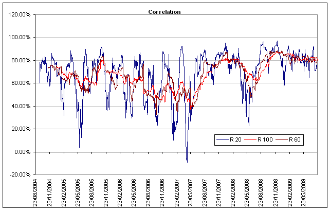
Renault versus Peugeot

ugfpcorr

  • 20 day correlation ranges from +4% to +90%
  • 60 day correlation ranges from +44% to +84%
  • 100 day correlation ranges from +50% to +80%.
  • Average correlation is fairly constant across all frequencies at 65% and standard deviations of the means start at 26% for 20 day reducing (non linearly) as one would expect with increasing sample size.
  • There appears to be no trend in correlations.
  • There is no clear cycle or periodicity to the fluctuations in correlation.


So, in any portfolio measurement system, which correlation does one use, 20, 50 or 100 day correlations? Or how about tick by tick data, or how about weekly data, or monthly data? They all suffer from the same problems. Statistical estimation techniques will assume that variances and correlations are time static, they will often use the whole sample thus ignoring the fluctuations of correlations and volatilities over the different frequencies. They assume that data is homoskedastic (variance is constant over time) as opposed to heteroskedastic (variable variances). Even where they deal with heteroskedasticity, a simple functional relationship is assumed for the evolution of variances.

Let’s ditch our statistical model for a moment and look at Renault and Peugeot (Includes Citroen).

  • Both are French.
  • Both make affordable cars.
  • Both make vans.
  • Both embrace diesels.
  • Both compete in pretty much the same geographies, product segments and price points.


You would expect price correlation or lack thereof to stem from differential quality of management. Quality of management is a fairly stationary quantity and does not fluctuate nearly as much as the fluctuations in correlations.

There are some dissimilarities. Renault owns a significant portion of Nissan providing it with more exposure to the highly competitive US market.

Now let’s look at Fiat. It’s European, it makes affordable cars, it makes vans, it makes diesels, and it competes in the same geographies. But wait, it owns Maserati, hardly in the same price point as Renault. It also owns Ferrari. But more than all this, it has a tractor and agri machinery and construction business (Case New Holland), it has a truck and commercial vehicles business (Iveco for all of you who have ever driven an army 3 tonner), it has a components business diversified from cars to trucks to industrial automation and it has a publishing business. One would naturally expect the price action of Fiat to be quite different from Renault. Yet even the100 day correlation has been in the 60% to 80% range.

The Usefulness of a Quant Portfolio Risk Management System:

There is no substitute for an in depth understanding of each asset in a portfolio, what are the risk factors responsible for its price variability, the current and historical relative strength of those risk factors in explaining price variability, the fundamentals underlying price variability, the dynamics of all the other participants in the market for that particular asset. This is a very tall order since it has to hold for each and every asset in a portfolio. The average human brain simply cannot cope with the number of moving parts in this problem.

A quantitative statistical risk management system can manage large amounts of data and present it in more manageable form. Detail is lost, but range is gained. Still, how much can one trust such systems? It seems that so much detail is lost, or not captured. Does it provide a trader with the necessary courage to execute what his gut instinct already tells him? Does it give the trader a false sense of control?

An investment manager can use a system to manage data, provided they have a good understanding of the limitations of the system and are not over-reliant on the output of the system. The more complex the strategy, the more complex the portfolio, the more diverse the portfolio, the less able is the human mind capable of managing all the diverse pieces of the puzzle. Delegating to a system when the underlying complexity is high also means that more detail is lost.

Unfortunately, investment management is not a very scalable business. It needs attention to detail, judicious use of systems and mathematics, a constantly probing and skeptical mind, and an utterly relentless search for underlying causality.

Three quants went hunting. One of them sighted a grouse taking flight and indicated it to the other two. The first took aim, fired but missed, aiming too high. The second took aim, fired but missed, aiming too low. The third whooped with joy: We hit it!.


Serial Correlations in Investment Returns

Autocorrelations:

The investment world loves correlations. Option hedgers love correlations. Everyone loves correlations. Across assets. But how about across time, within the same asset? To what extent do the returns today depend on the returns yesterday, the month before, 3 months before or a year ago? Positive correlations with past returns are a sign of momentum, negative correlations, of mean reversion. Assets can exhibit both, all at once. Smoothing of returns also shows up as serial correlation or a moving average. Liquid markets with efficient price discovery tends to exhibit little serial correlation. Here is a quick – non rigorous – illustrative view of serial correlations in different markets.


Equities:

MSCI World autocorrelations. The strongest autocorrelations of the MSCI world are in the 1 month lags. That said, this autocorrelation is not statistically significant. You can see how unstable the autocorrelations look over time. Equities are liquid and price discovery is efficient and as expected, data appears not to be autocorrelated.


MSCI World Autocorrelations (Simple)*

mxwdARP


Hedge Funds:

Hedge fund autocorrelations are weak and display little structure over time as well. There have been studies into hedge fund autocorrelations which find evidence of smoothing. Over a 2 year period, tests for autocorrelations are not significant and graphically one can see how unstable the autocorrelations look over time. This is certainly true of the HFRI Hedge Fund Index. A similar pattern is seen in the HFRI Fund of Funds Index. Of course there are strategies which exhibit autocorrelation. These tend to be strategies in illiquid markets or securities where the pricing of the underlying assets are less efficient. Assets that have their valuations smoothed, are valued on appraisal value as opposed to transacted values, are based on comparable transactions with a lag, which are marked to model, tend to exhibit serial correlation. The HFRI Indices exhibit little serial correlation primarily because of the preponderance of liquid equity and macro strategies. Strategies involved in assets such as the illiquid range of credit, PIPEs, private equity, tend to exhiit serial correlation.


HFRI Hedge Fund Index Autocorrelations (Simple)*

HFRIARP


HFRI Fund of Hedge Fund Index Autocorrelations (Simple)*

HFRIFOFARP


Real Estate:

Real estate returns display high autocorrelation and the 1 month autocorrelation is statistically significant. Variances (and hence volatility) are therefore understated, sometimes severely, as are correlations to other assets. The Case Shiller data goes back about 10 years but the UK IPD index goes back over 20. In both cases one can see the stability of the 1, 2 an 12 month autocorrelations.


S&P Case Shiller Autocorrelations (Simple)*

CaseShillerARP


IPD UK Property Autocorrelations (Simple)*

IPDARP


Issues with Serial Correlation:

Where returns are serially correlated:

  • Volatility is not consistently estimated and is often underestimated
  • An estimator for the true volatility can be estimated but there is error of estimation involved.
  • Correlations are not consistently estimated and are often underestimated
  • Portfolio level risk measurement is therefore not consistently estimated and is often underestimated

Opportunities in Serial Correlation:

Whatever the true underlying volatility of the real estate markets, the Case Shiller and UK IPD real estate indices will be smoothed. Currently it appears that they are on a recovery path and will likely be positive for the next 12 to 18 months. Real estate indicators will likely remain positive despite the true picture on the ground.

Serially correlated assets have underlying volatility that is under-estimated. Correlations with other assets, even liquid, non-serially correlated ones will be under-estimated as well. That means that a volatility of a portfolio of such assets will be under-priced.


*note that the autocorrelations shown here in the charts are simple pairwise autocorrelations and not the rigorous a multi lag model as the graphical representation of the results is hard. Tests for significance are done with the multi lag models.